Ilya
Doronkin.
Designer of brand systems and digital material. UX/UI, email design, identity and print. I work in Figma and Illustrator, a little After Effects.
One client, shown in full: SPID.CENTER, a Moscow foundation that helps people living with HIV and runs prevention work.
Everything here ships in Russian, so the screenshots are Russian too. Four things worth knowing before you scroll. The foundation's working typeface is Gerbera, a Cyrillic-first family, which is why the letterforms may look unfamiliar. The red horse and the small figures are the foundation's existing mascot, drawn before me. СПИД.ЦЕНТР is the Russian spelling of the name; the English-language site of the same organisation runs as AIDS.CENTER. And «шмв» is the Cyrillic abbreviation of its medical school for young doctors, which has its own website further down this page. Captions explain what each screen is.
I pulled a scattered identity into one brand book
The identity lived as loose files in Figma, and everyone assembled layouts their own way. I compiled a 14-page brand book: brand voice, logo rules, symbols, the «one signal red» palette, typography, illustration, the interface layer, and a checklist of what not to do. Keeping the look consistent is now my job.

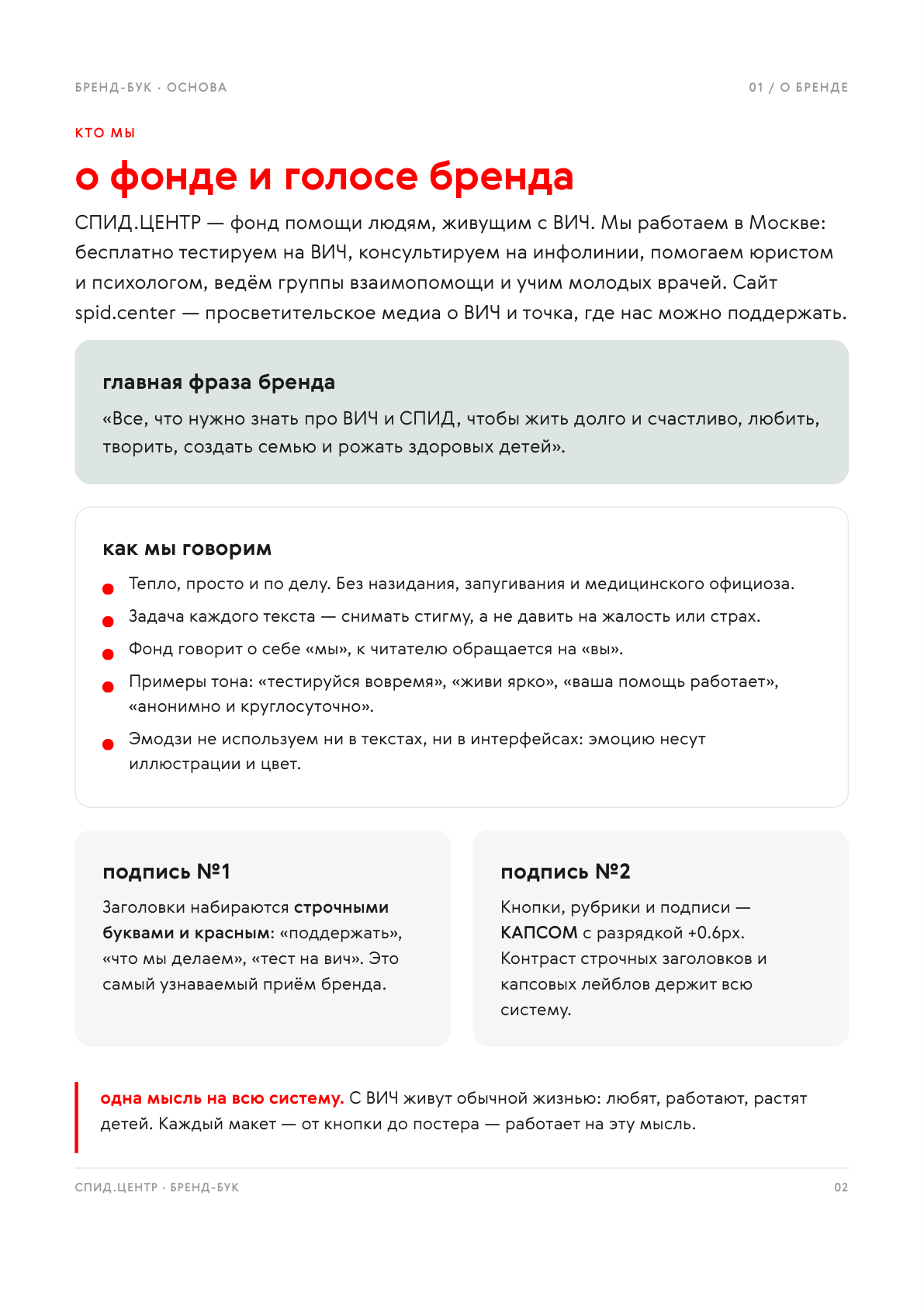
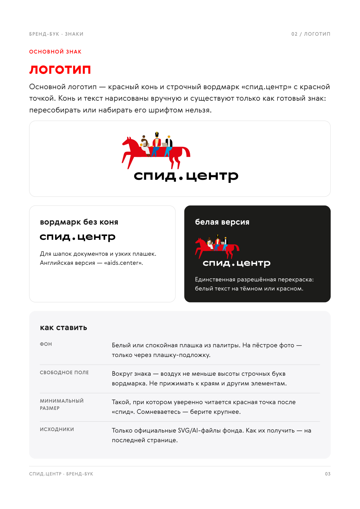
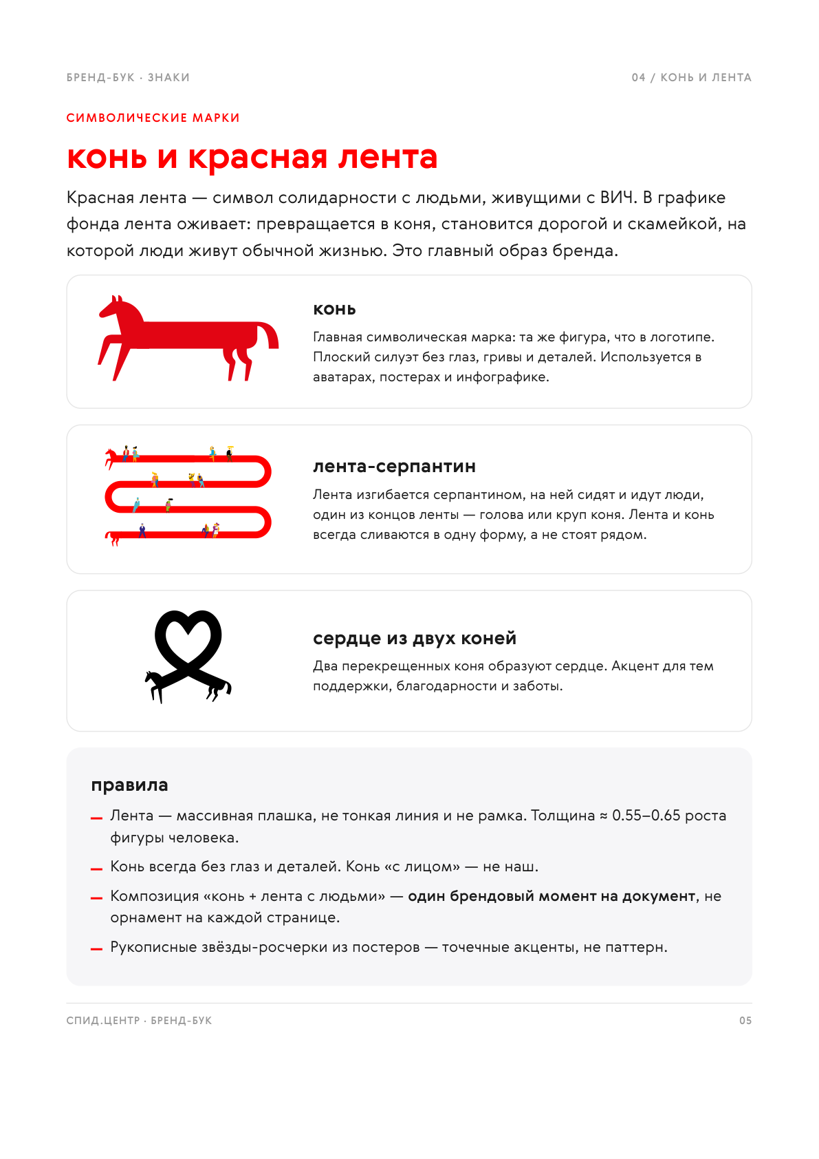
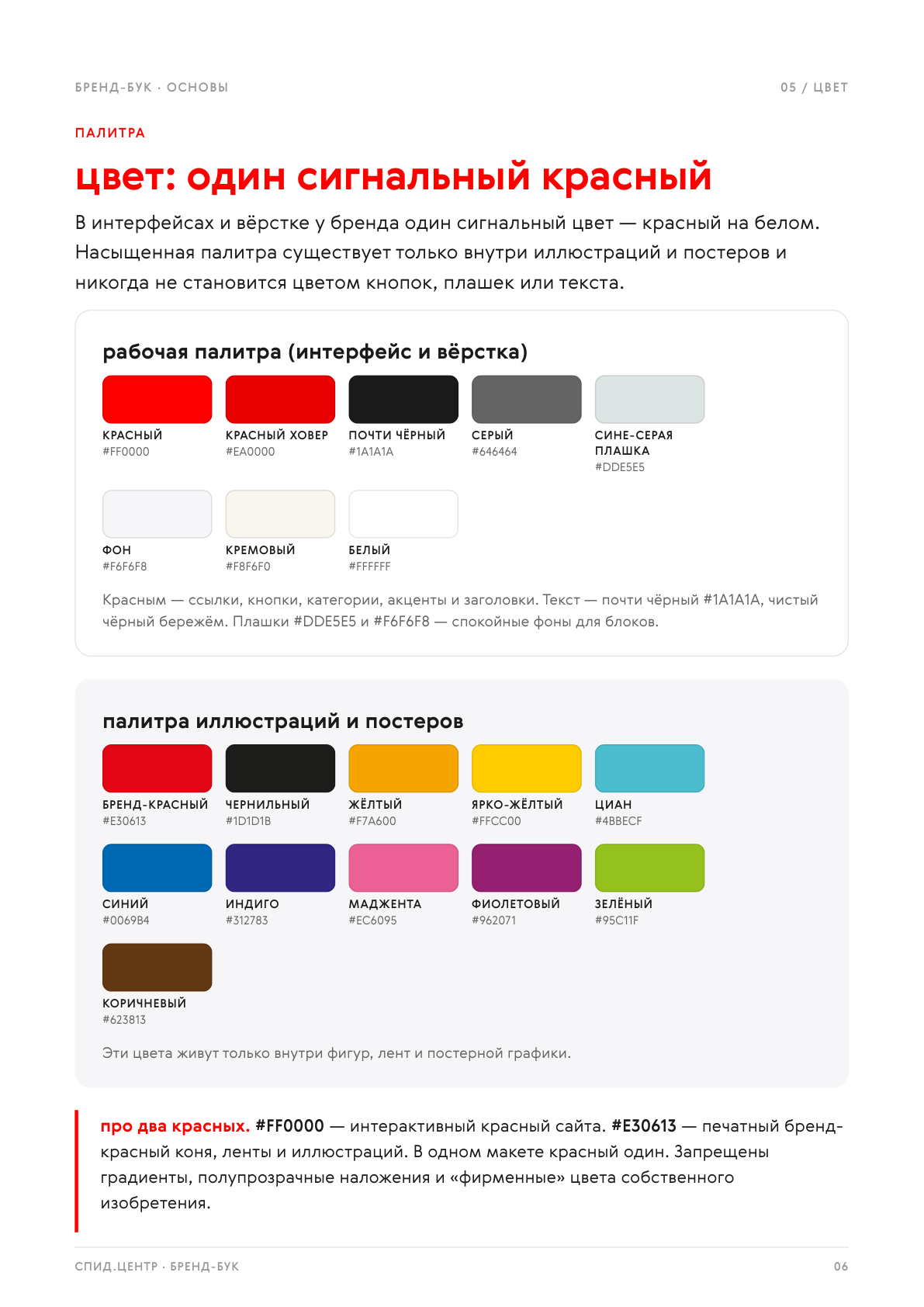
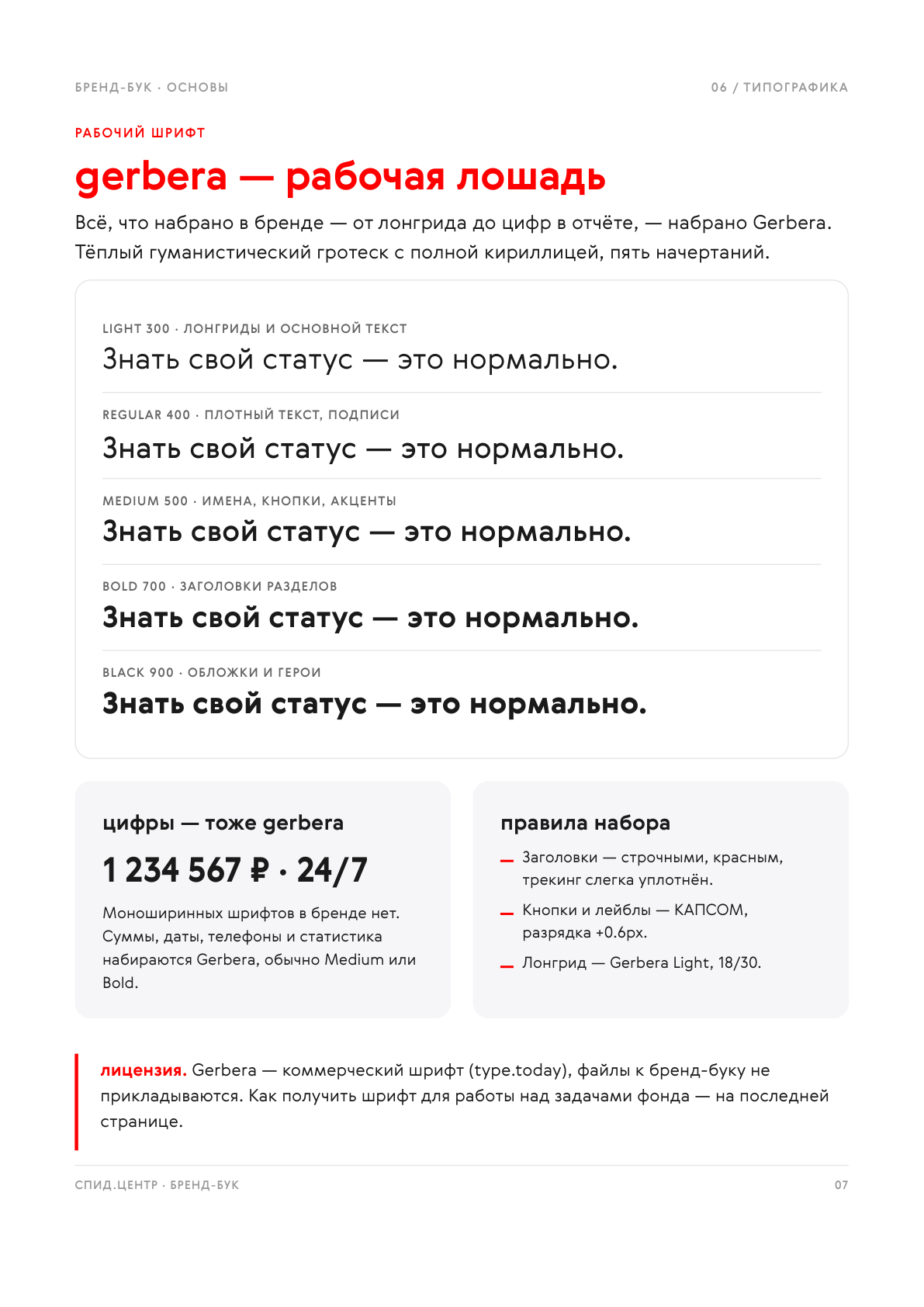
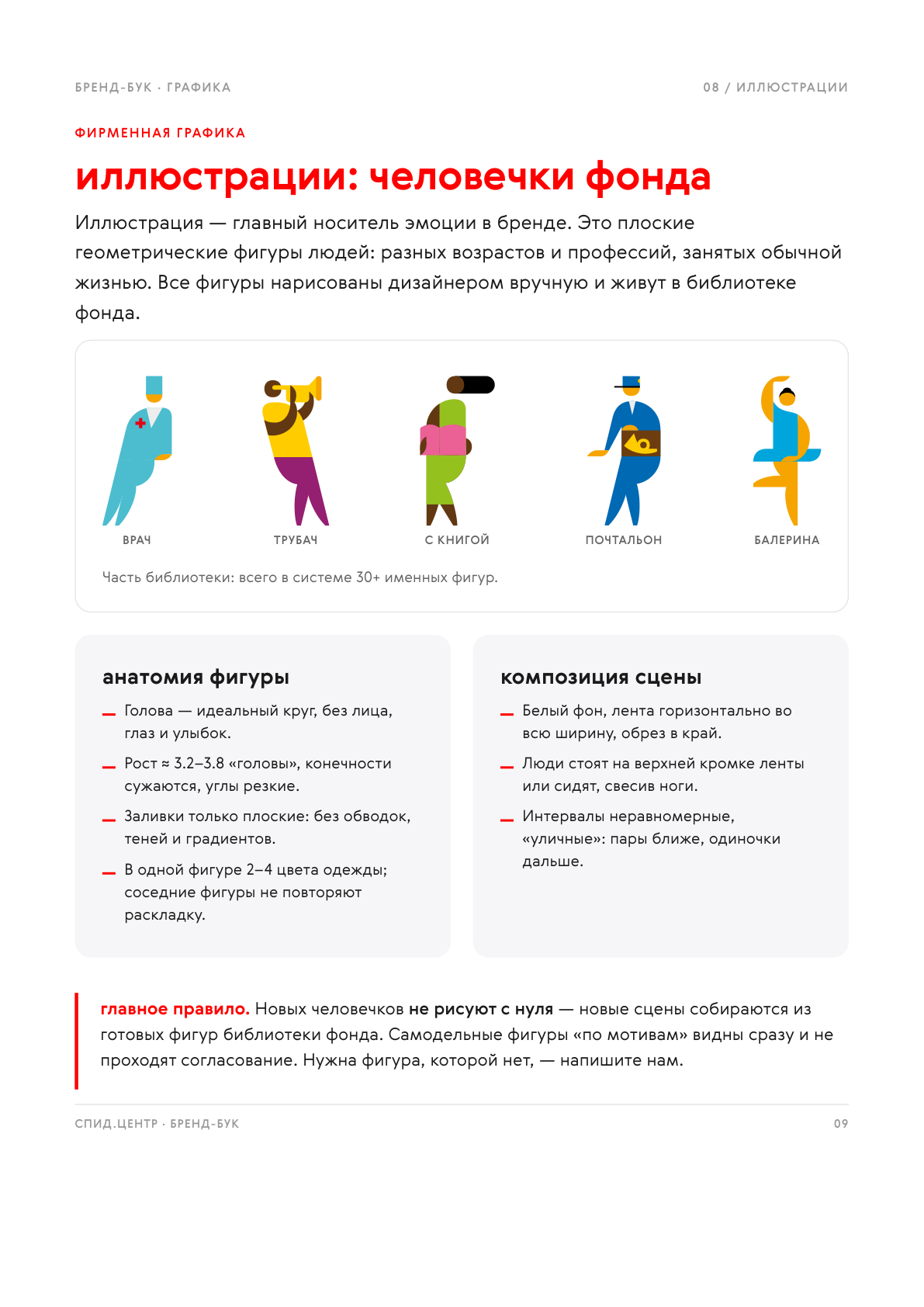
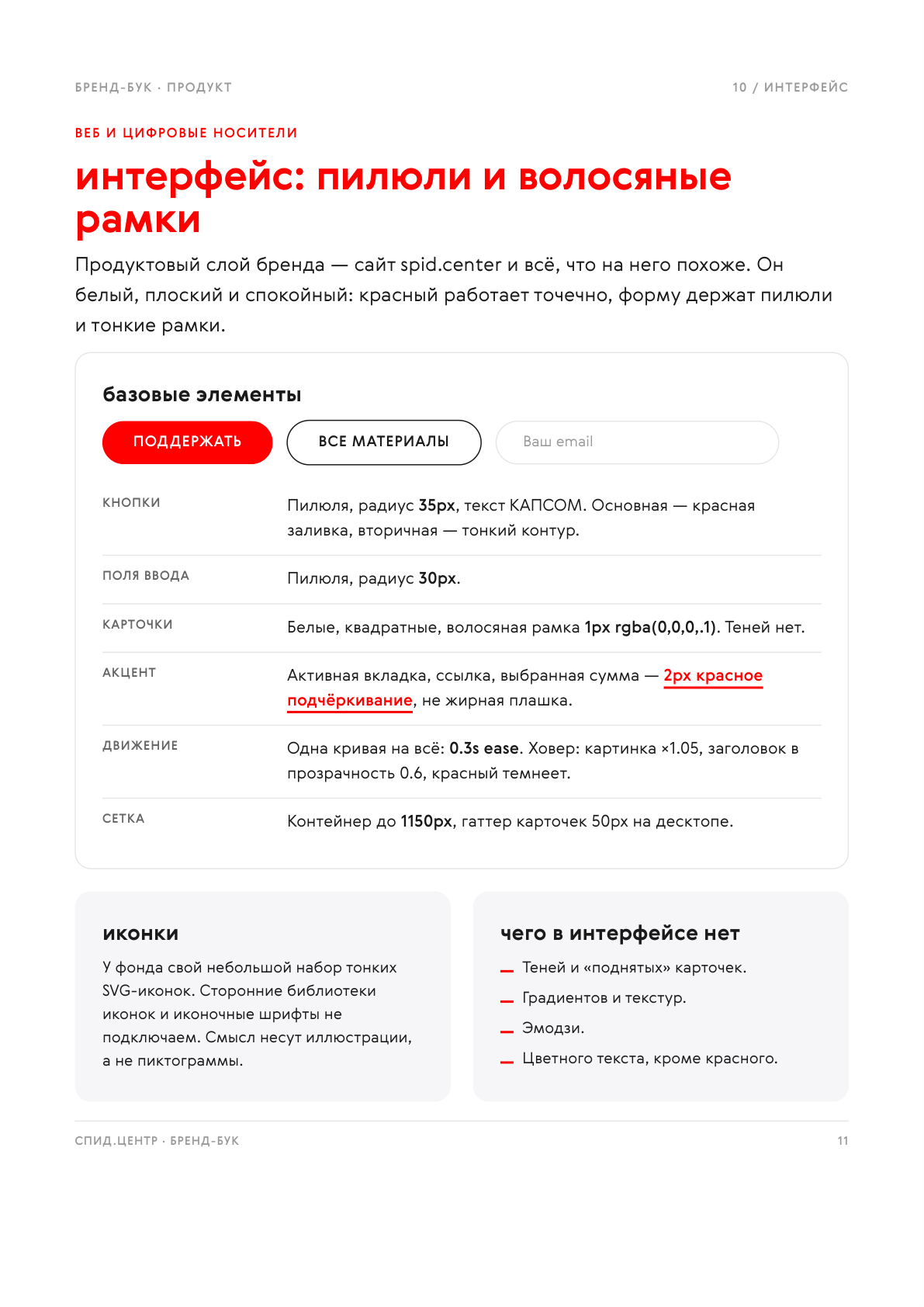
Click a page to open it full size. The mascot illustrations, the horse and the small figures, belong to the foundation; my work is the system, the rules, the composition and the layout.
A series of donor emails
Three emails built out of the brand for three audiences: lapsed donors, one-off donors invited to switch to a monthly gift, and current monthly donors. The infographics use the foundation's real figures, and the markup is built to survive email clients.



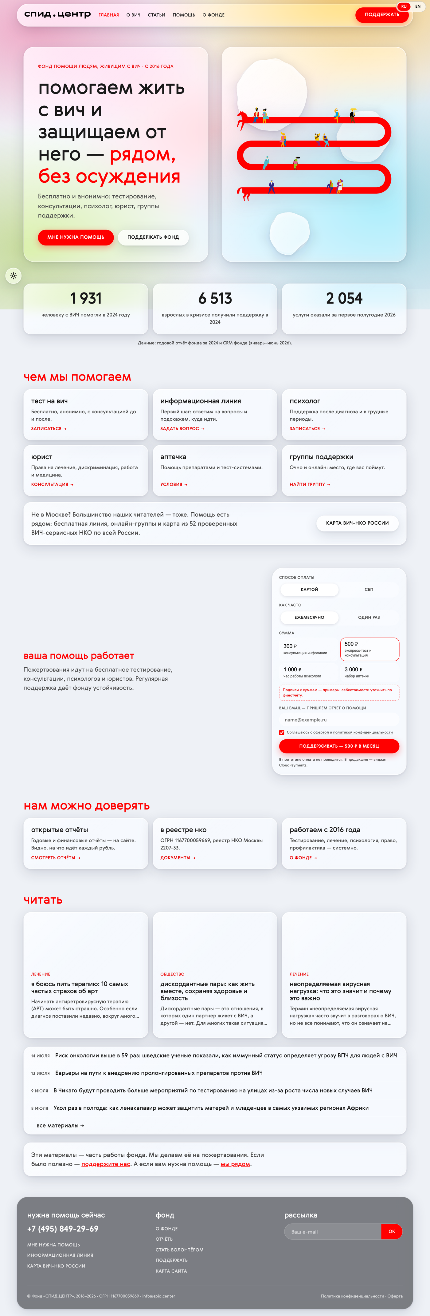
Redesign of the foundation's website
A UX prototype and a home page built on one idea: one page, three routes, for someone who needs help, for a donor, and for a reader. The brand system carried over into the browser. It lives as a working preview for the staff at redesign.spid.center.
A website for the medical school, rebuilt from scratch
The foundation runs a school on HIV medicine for students, residents and young doctors: 26 cohorts since 2018, each a five to six day intensive. Its website still ran on 2020 code, and the editor typed straight into an admin panel with no drafts and no preview, so every correction went live immediately. I took the visual language from the approved campaign for cohorts 27 and 28: a grey-blue clinical background, black Gerbera, the red handwritten «шмв» mark instead of a decorative display font, cobalt doctor figures, and documentary photographs of the classes. Red stayed the only signal for action, so the apply button reads on every page. Speaker, cohort, lecture and testimonial cards are deliberately built differently, otherwise the pages collapse into one long list.
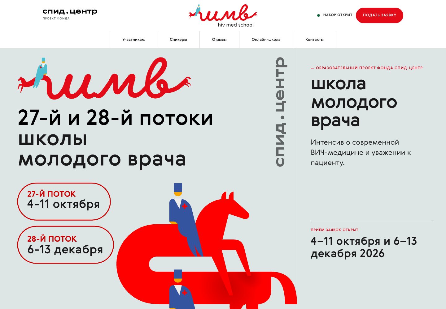
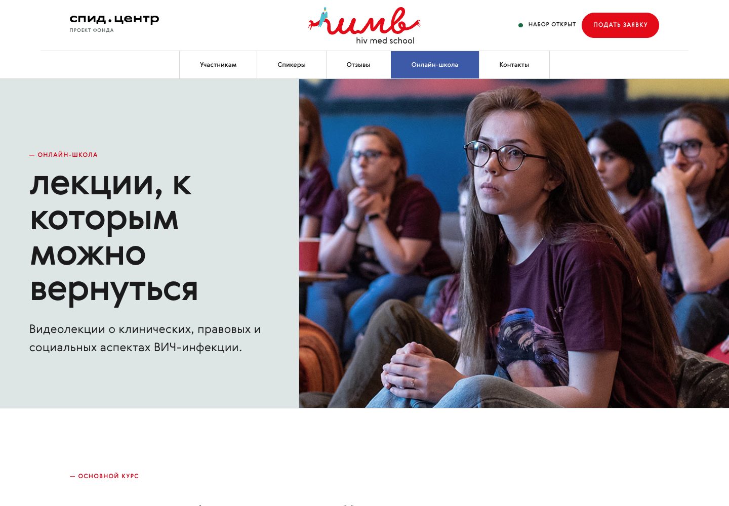
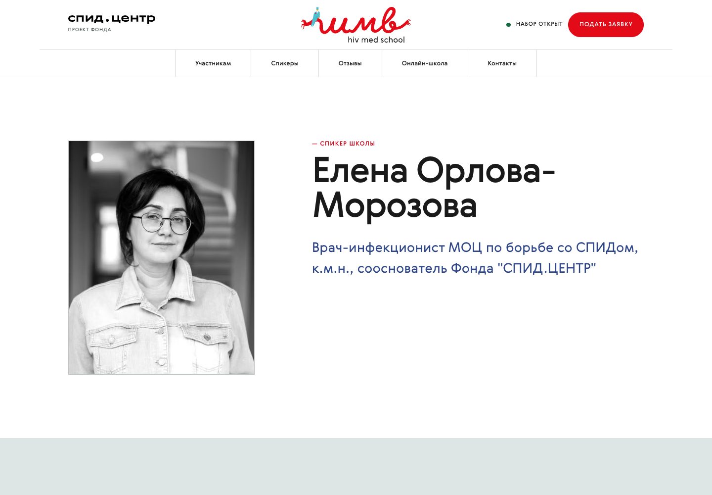
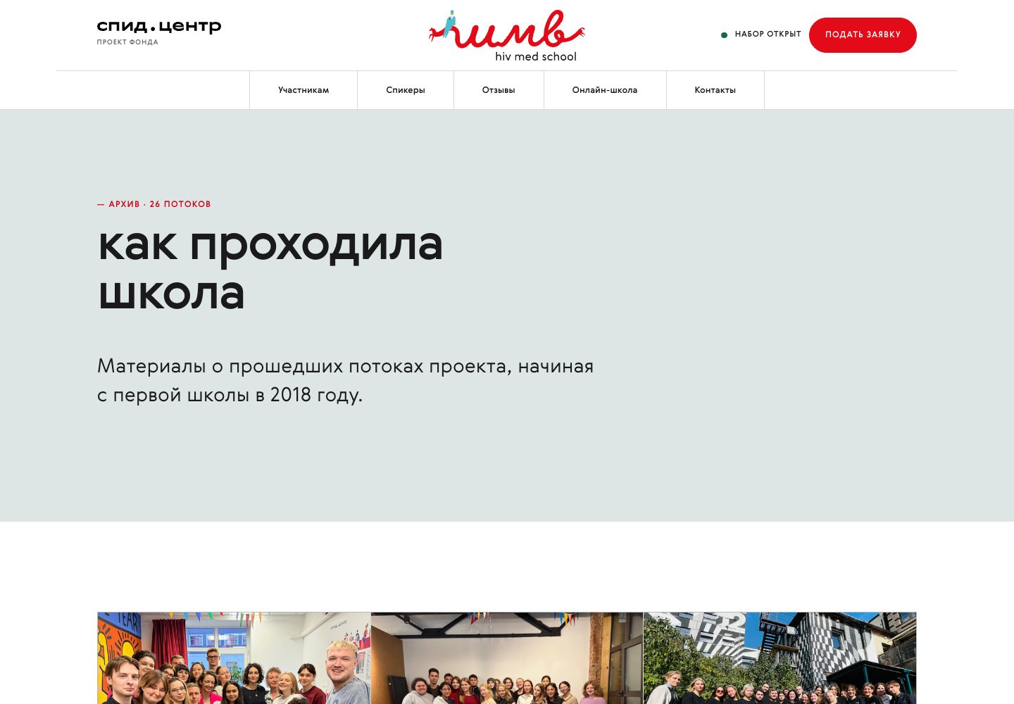
Live screenshots of the closed preview, August 2026. The photographs are real shots of past cohorts. The production site has not been switched over yet: that call belongs to the foundation.
Enrolment cards for social media
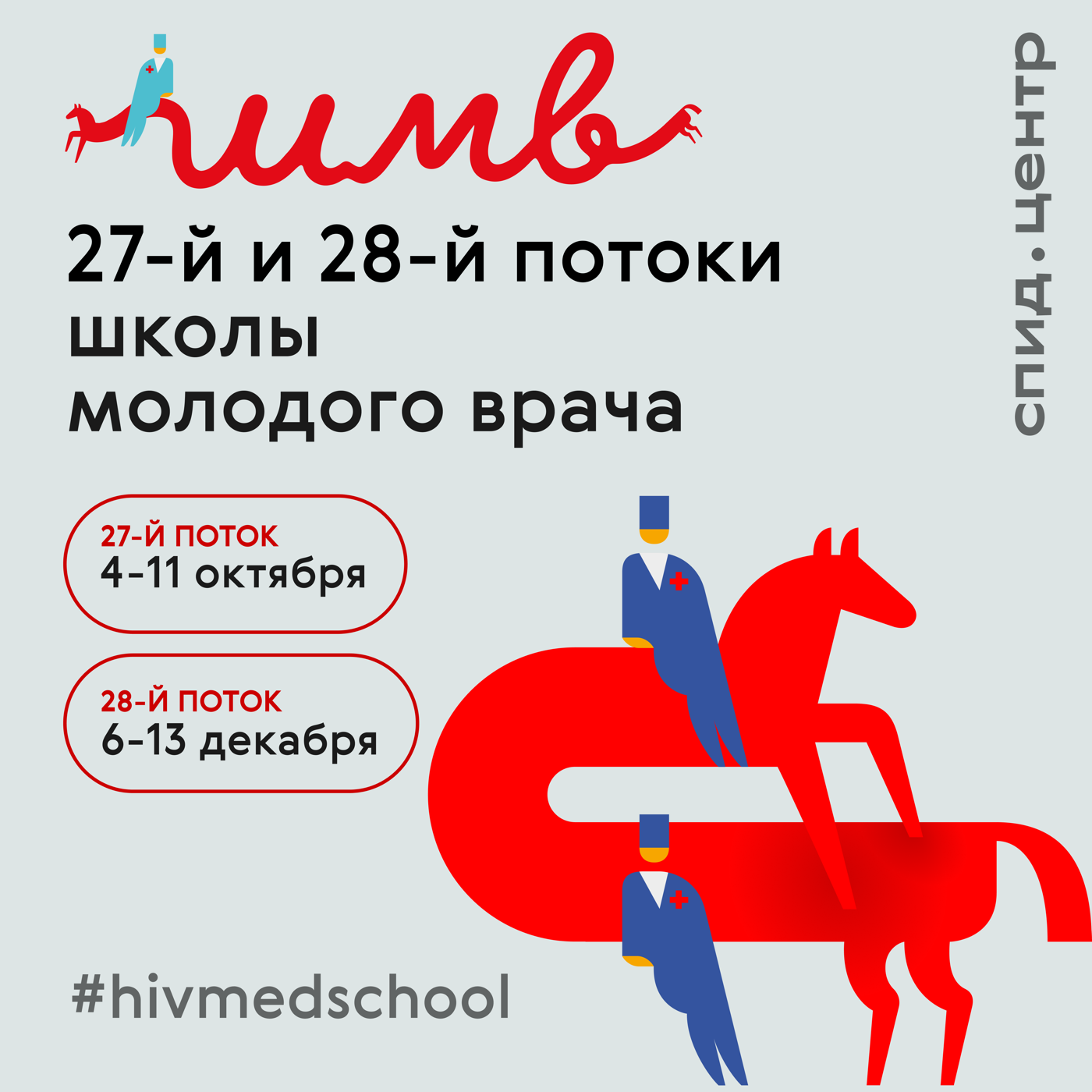
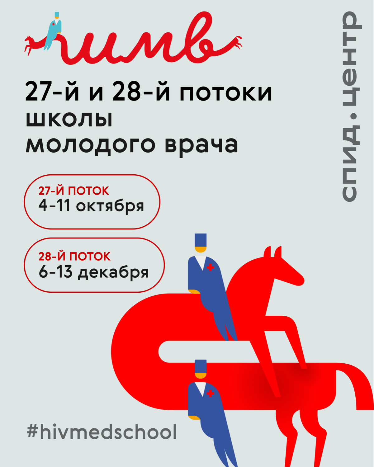
The announcement of two cohorts in two formats: a square for the feed and a 4:5 vertical. The composition hangs on the handwritten «шмв» mark, which runs into the horse carrying the doctors. The card keeps only the headline, the cohort numbers and the dates; everything else goes into the caption of the post. The whole visual language of the school's website grew out of this pair.
Posters and one-off material
One-off pieces for the foundation: a call-to-action poster, lecture announcements in two formats, and an anniversary motion poster.



Honest about authorship. The mascot, the red horse and the small figures, is SPID.CENTER's existing identity and I did not draw it. The photographs on the school's site and in the announcements are the foundation's own shoots. My work is bringing scattered assets into a system, building the brand book, the emails, two websites and the enrolment graphics, and keeping the look consistent. Rough layouts I often assemble with scripts and AI agents, and finish the composition by hand: that is how the school cards and the lecture announcements were made. Every number on these layouts is real foundation data, with sensitive details removed.