Ilya
Doronkin
Designer. Websites and interfaces, brand systems, emails, print. I work in Figma and Illustrator, a little After Effects.
One client, shown in full: SPID.CENTER, a Moscow foundation working with HIV, and its school for young doctors.
Everything here ships in Russian, so the screenshots are Russian too. The foundation's working typeface is Gerbera; «шмв» is the Cyrillic short name of the school.
Site for the school of young doctors
The school has been running intakes since 2018. I took the visual language from the approved campaign for the 27th and 28th intakes: a grey-blue clinical ground, black Gerbera, the handwritten «шмв» mark instead of a display face, cobalt figures of doctors and documentary photography from the classes. Red stayed the only signal for action, so the application button reads on any page. Speaker, intake and lecture cards are built differently, otherwise the pages collapse into one long list.
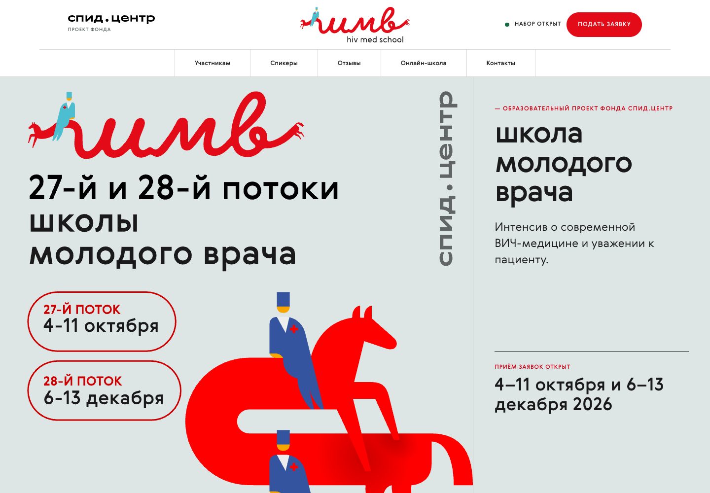
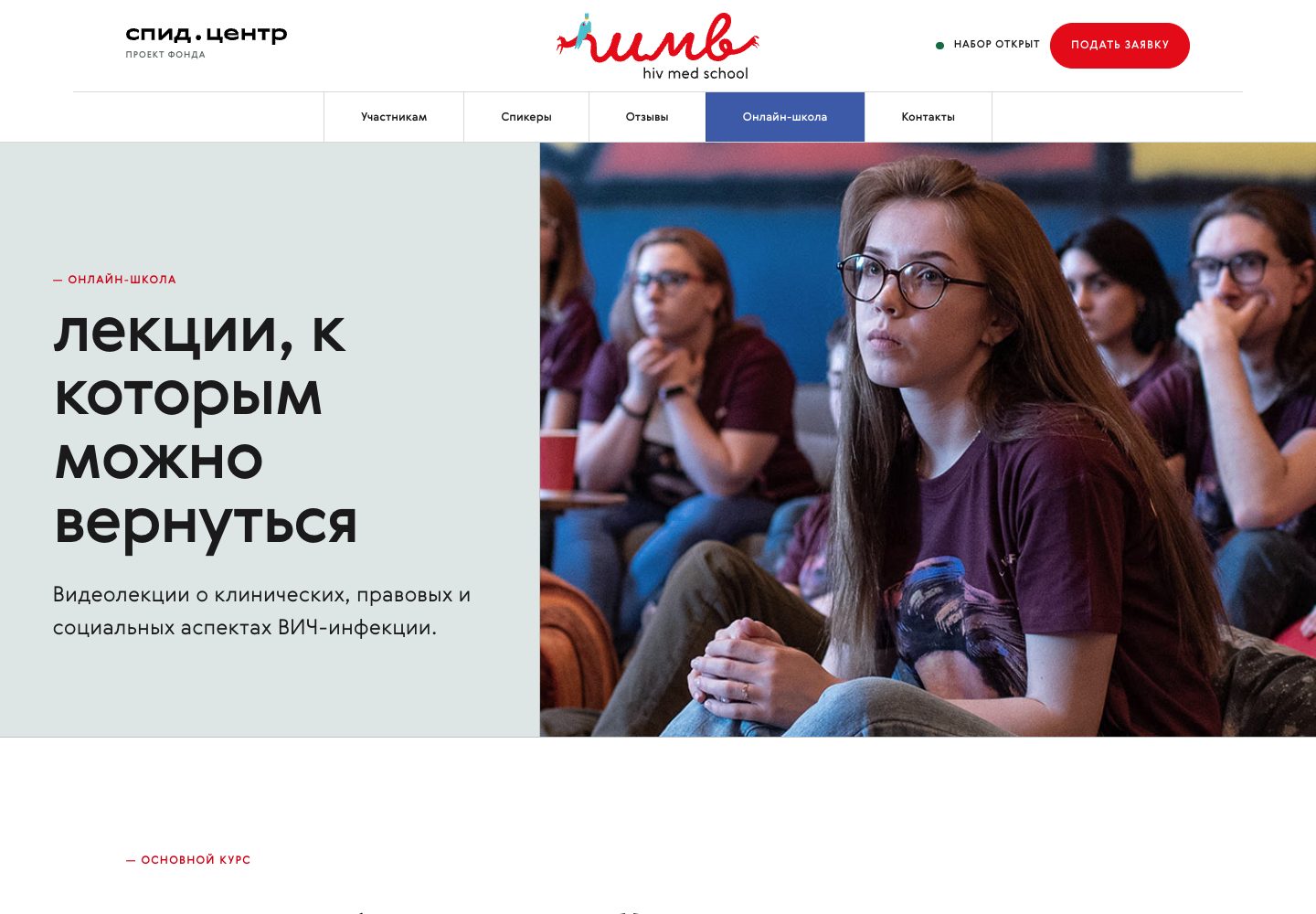
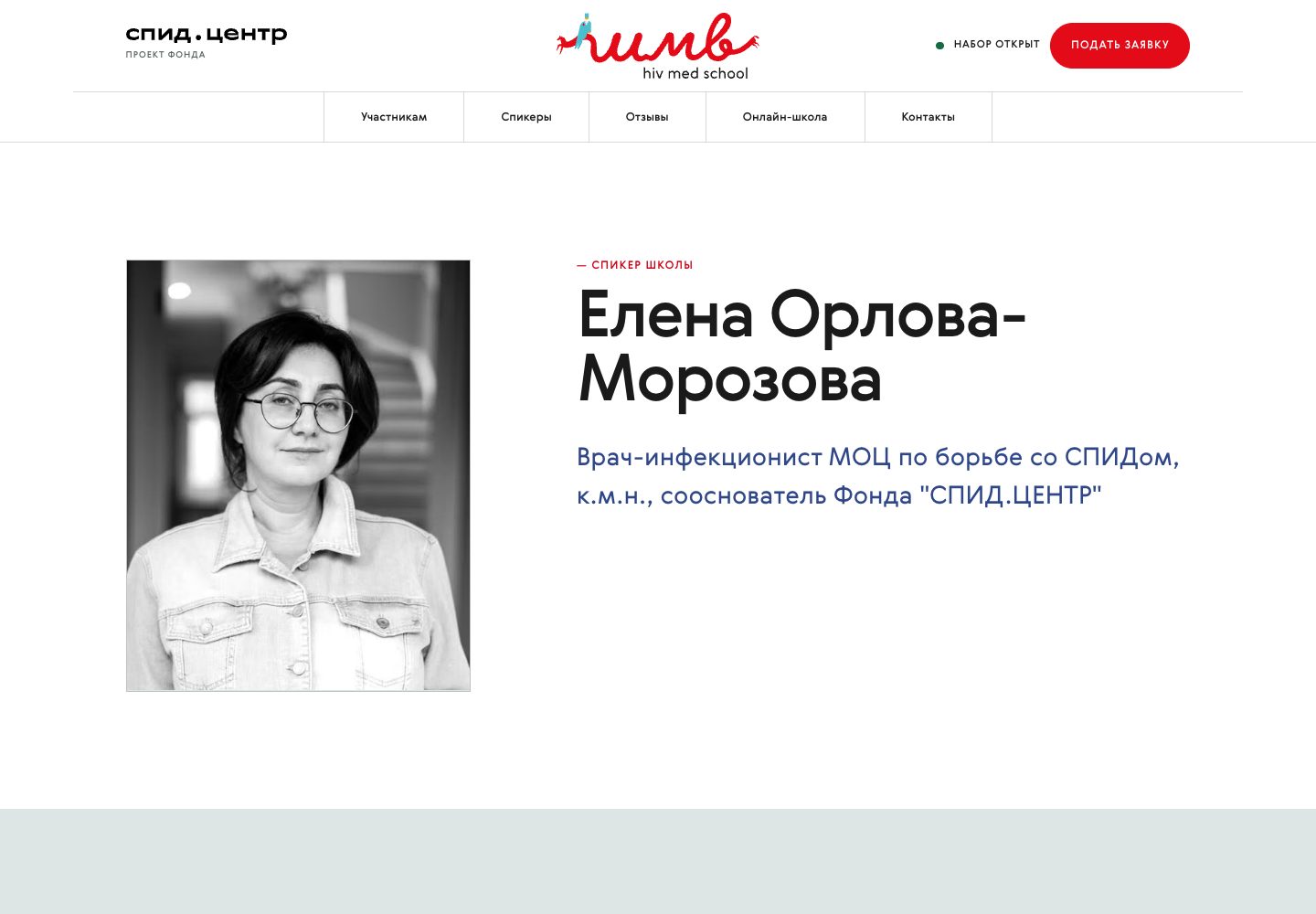
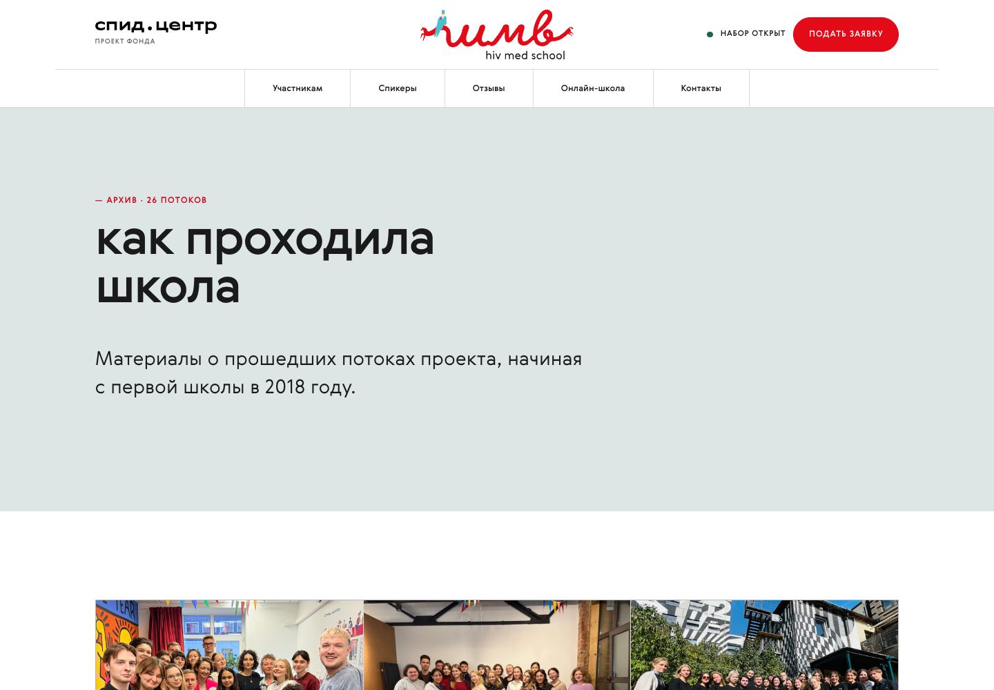
The site is live at vera.school. The photographs are the foundation's own shoots of past intakes.
Redesign of the foundation site
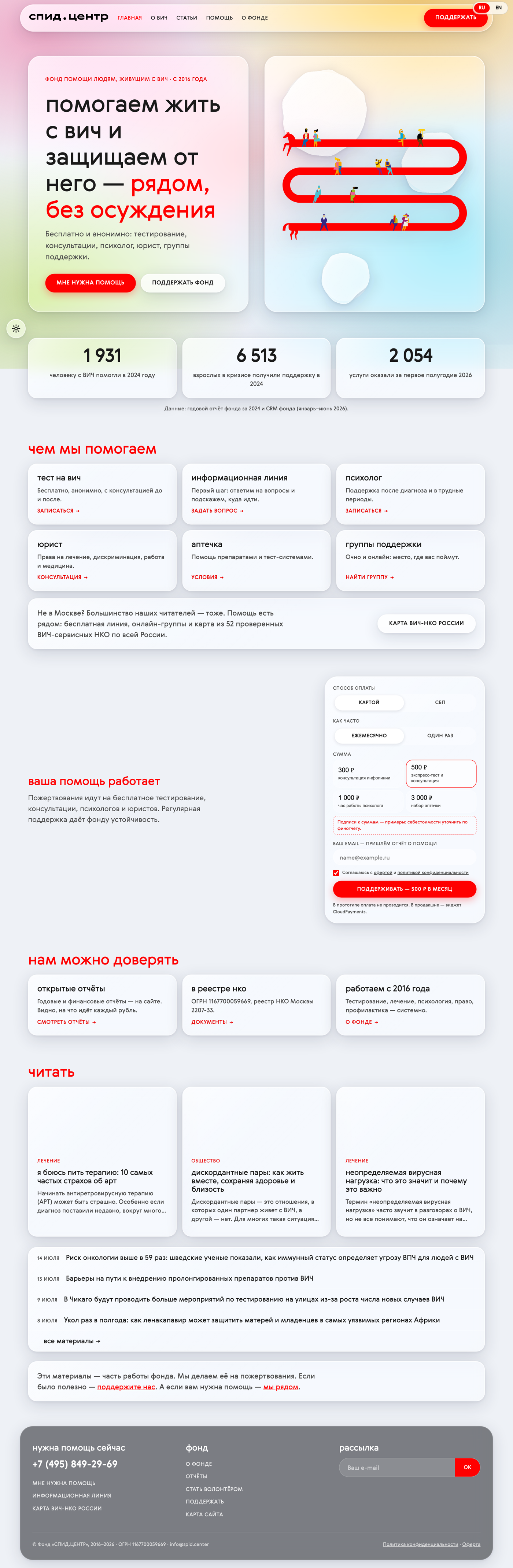
The home page is built around one page and three routes through it: someone seeking help, a donor, a reader. The brand system moved into the web.
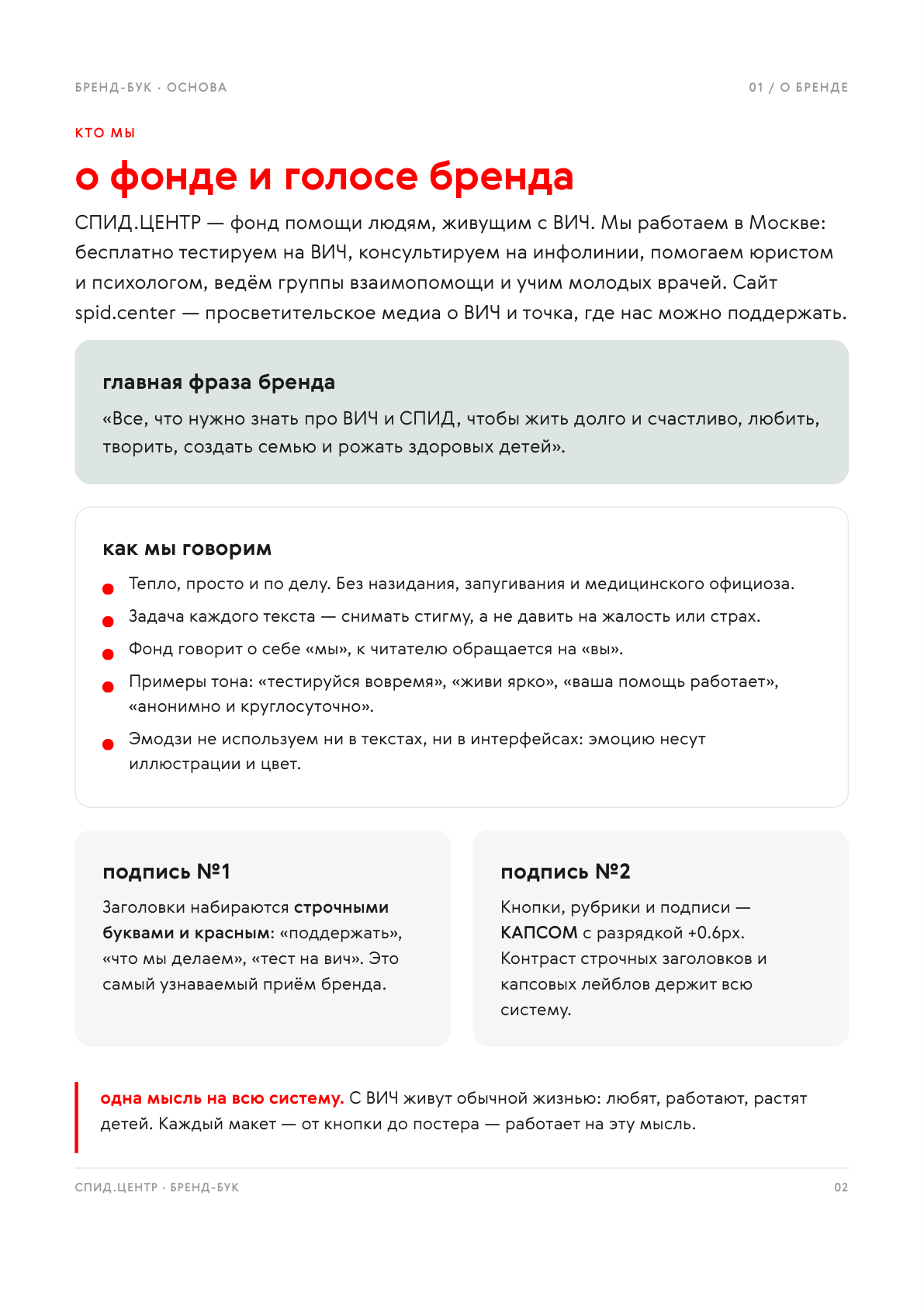
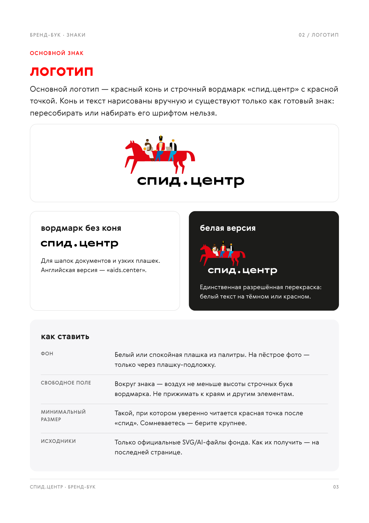
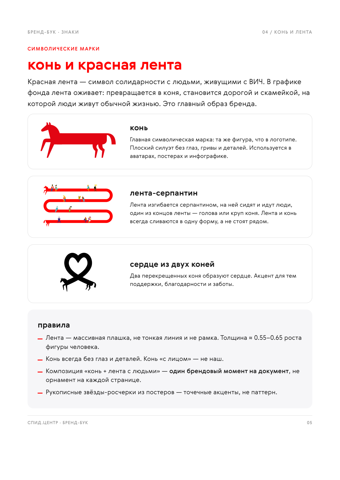
The foundation's identity, gathered into a brand book
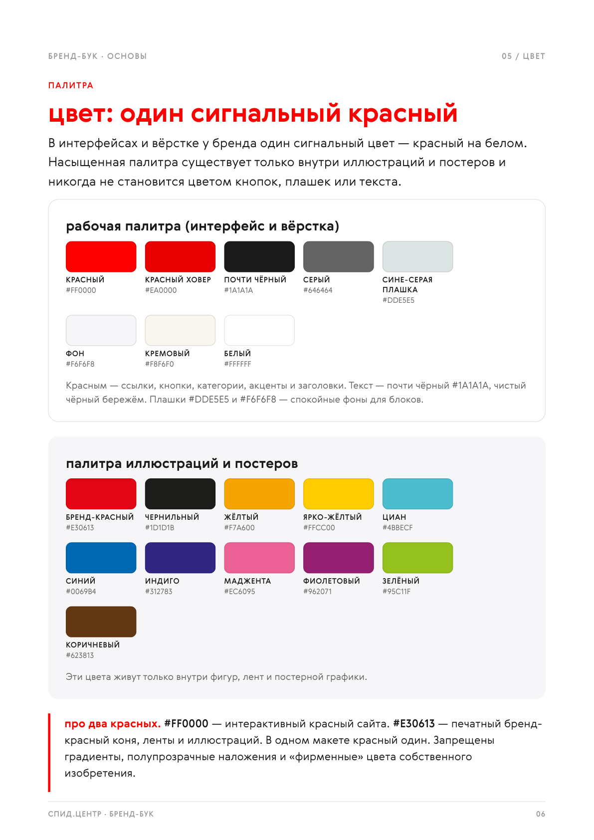
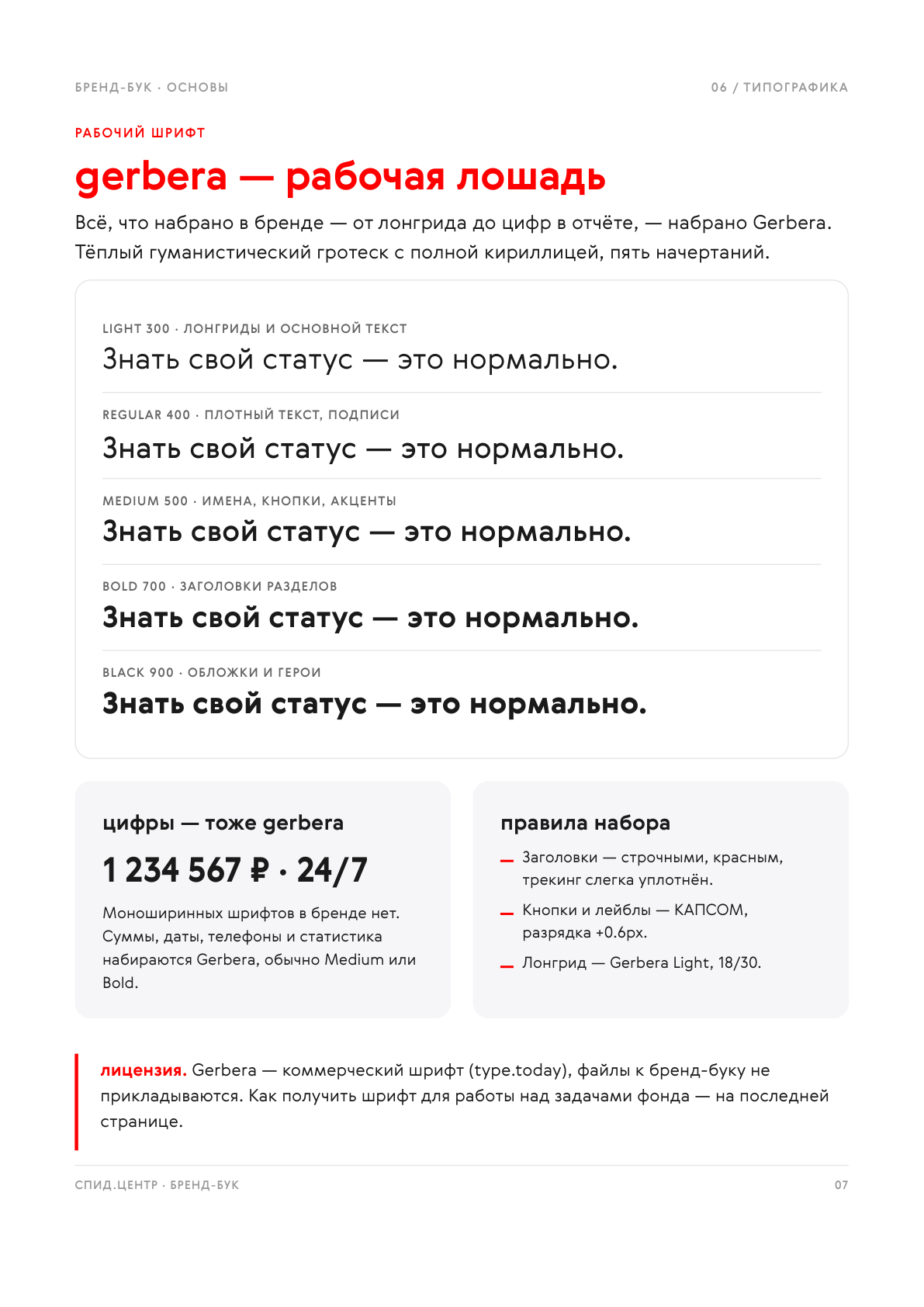
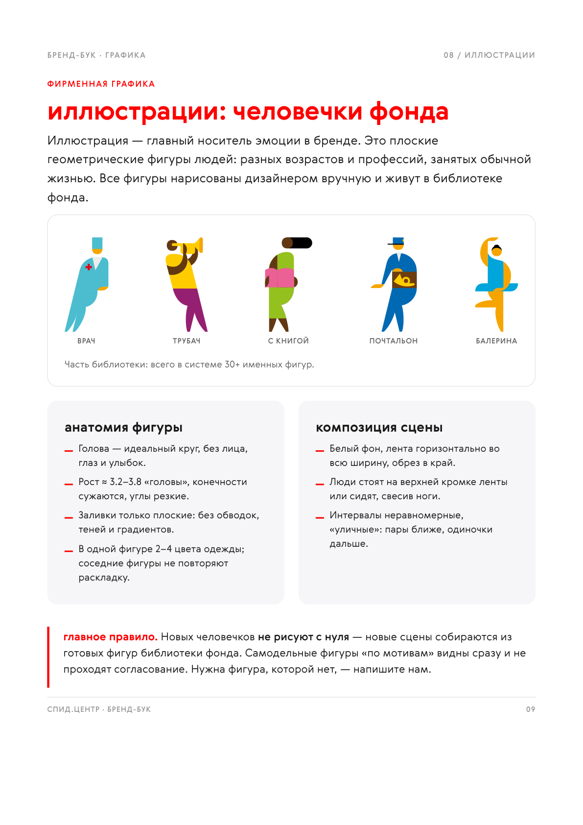
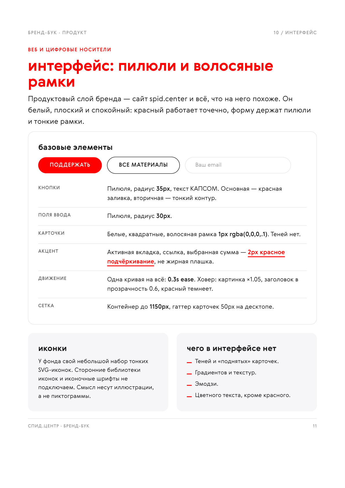
The identity lived scattered across Figma files and everyone built layouts from it their own way. I pulled it into a 14-page brand book: brand voice, logo rules, the symbols, a palette with one signal red, typography, illustration, interface and a list of what not to do.

Donor email series
Three emails for different audiences: reactivating lapsed donors, inviting one-off givers into a subscription, and reporting back to regular donors. Infographics on the foundation's real numbers, built to survive email clients.



The emails are long, so only the opening shows. Click to read one in full.
Enrolment cards for social media
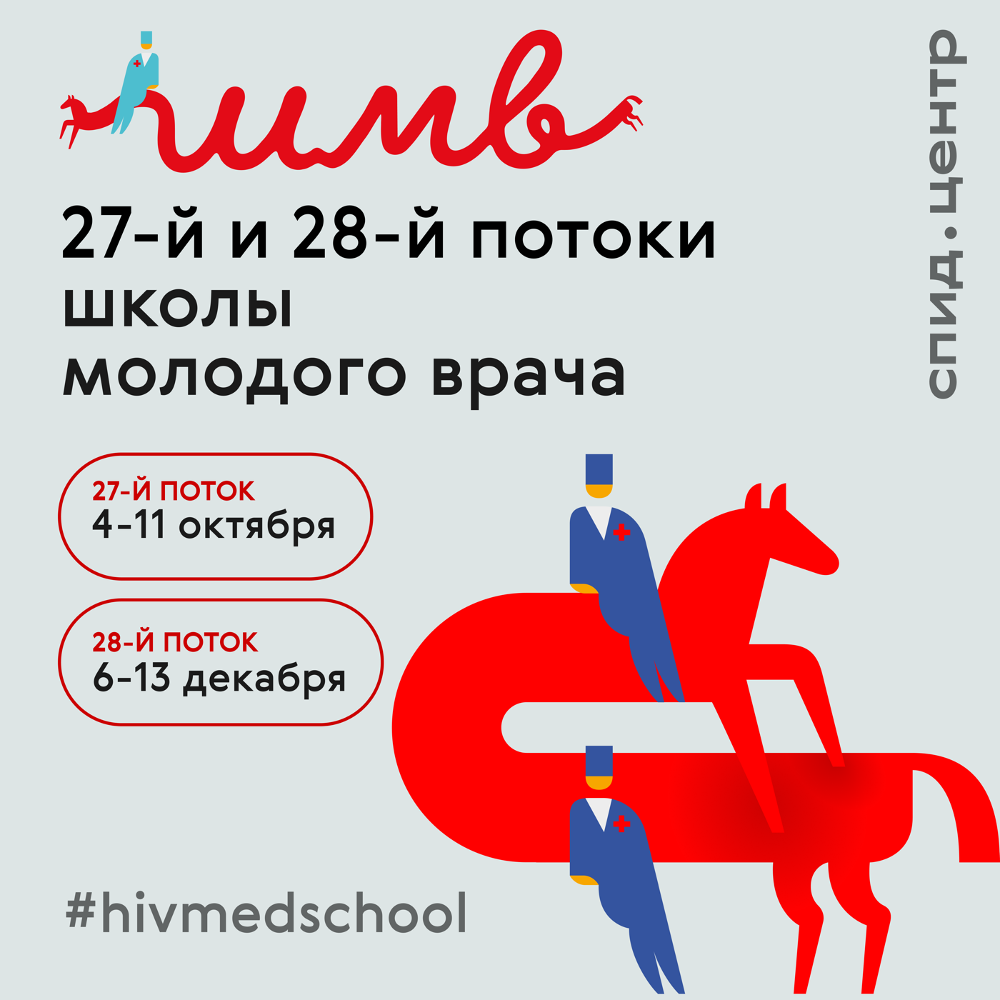
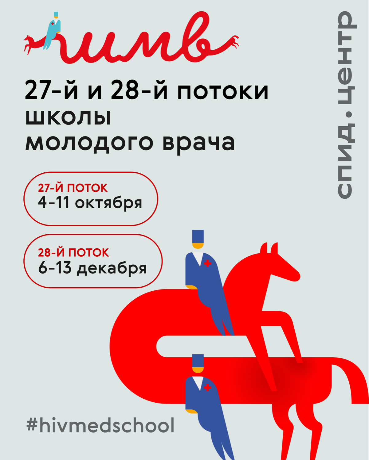
Announcing two intakes as a square for the feed and a 4:5 vertical. The composition rests on the handwritten «шмв» mark that turns into the horse with doctors. The card keeps the headline, the intake numbers and the dates; everything else moves into the post caption. The whole visual language of the school site grew out of this pair.
Cards, posters and motion
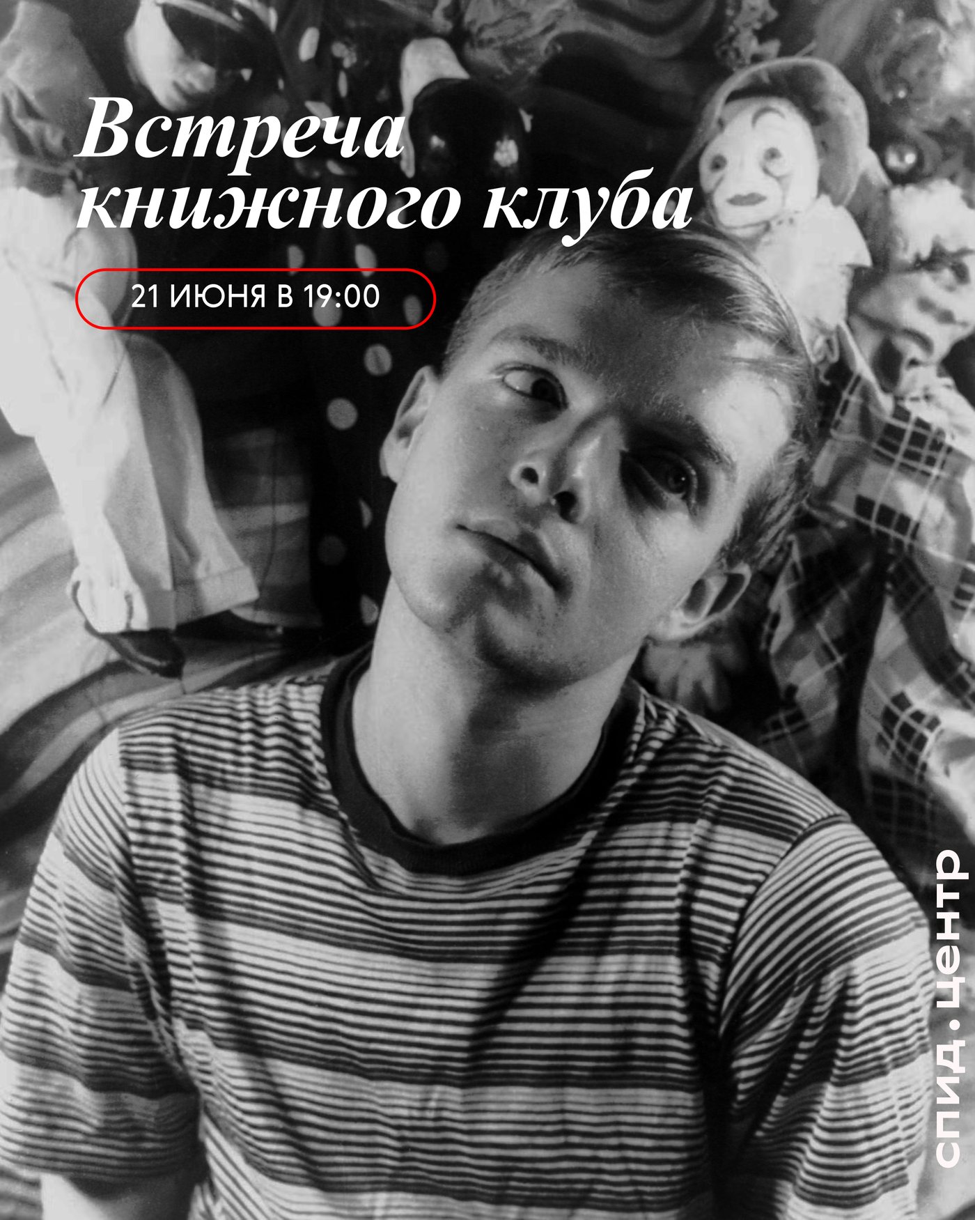
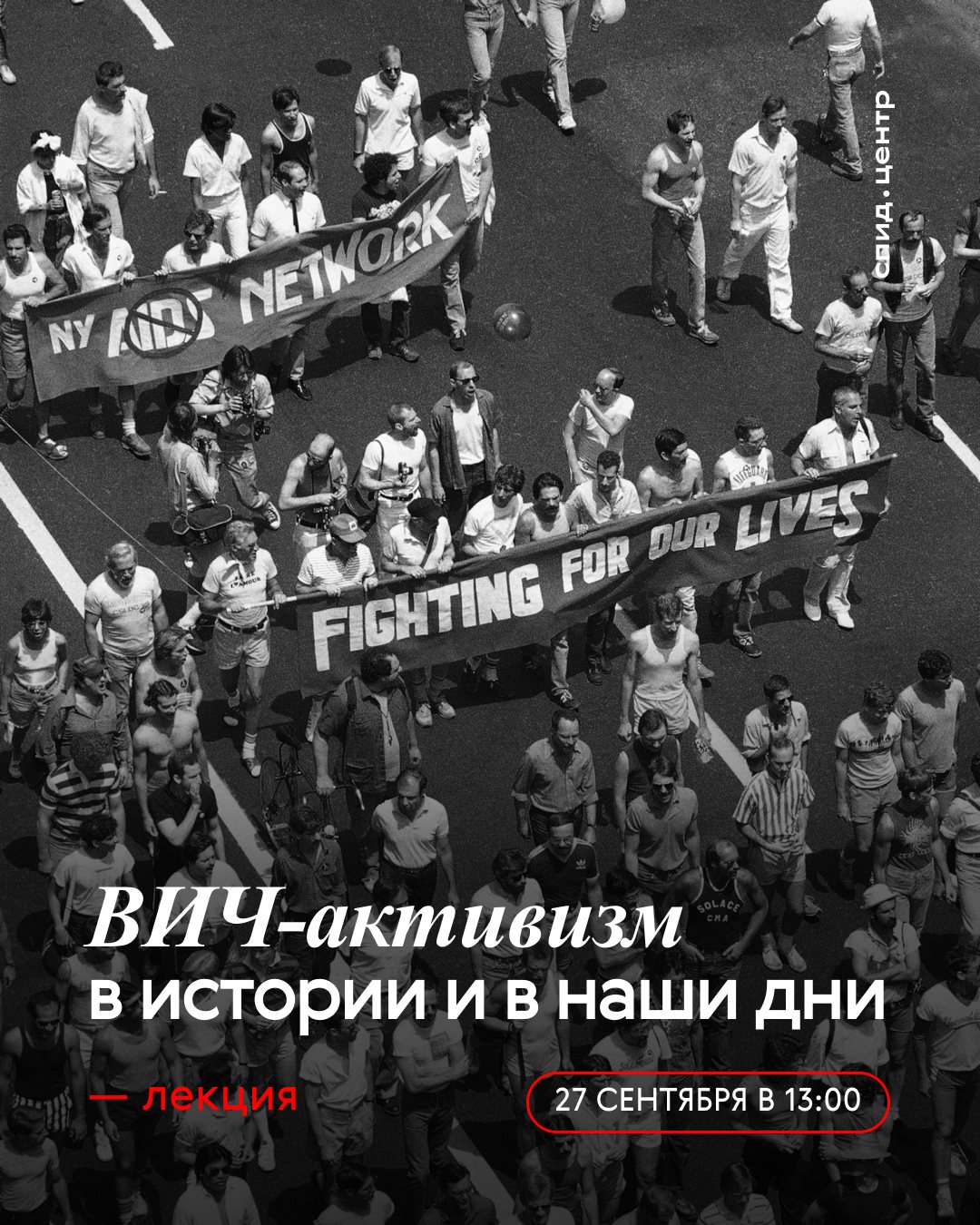
Announcements for events and lectures, news cards for social media, a campaign poster and an anniversary motion piece.
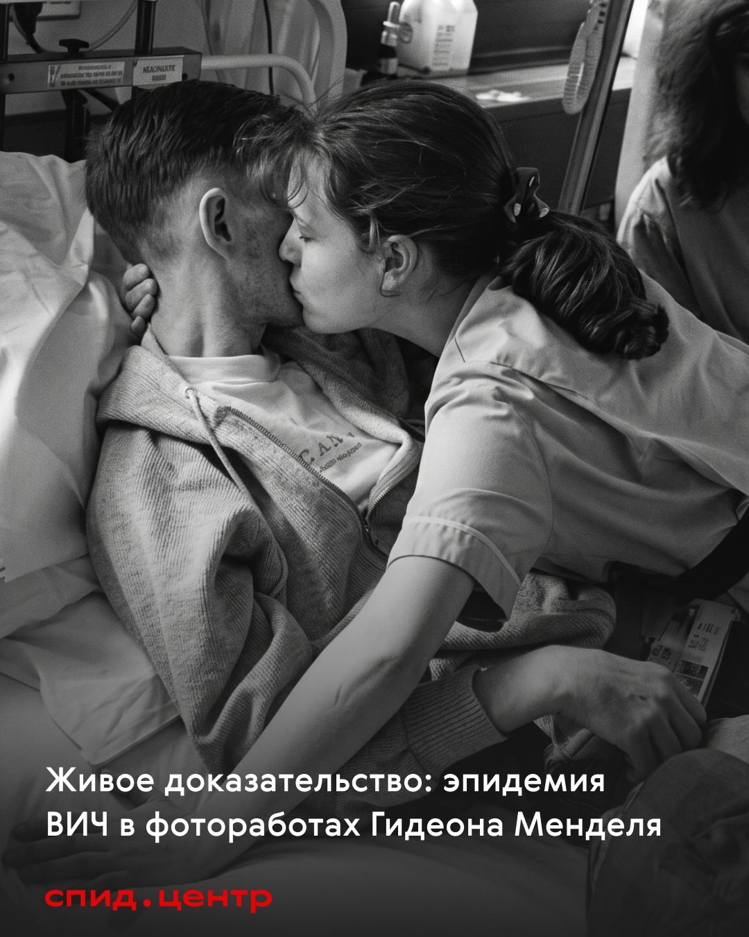
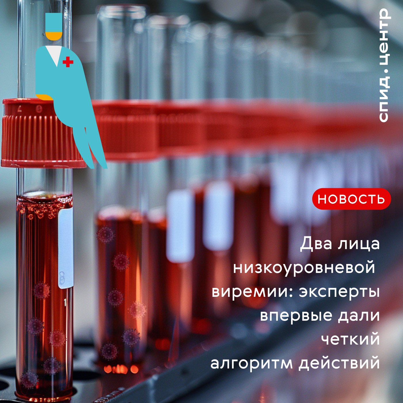
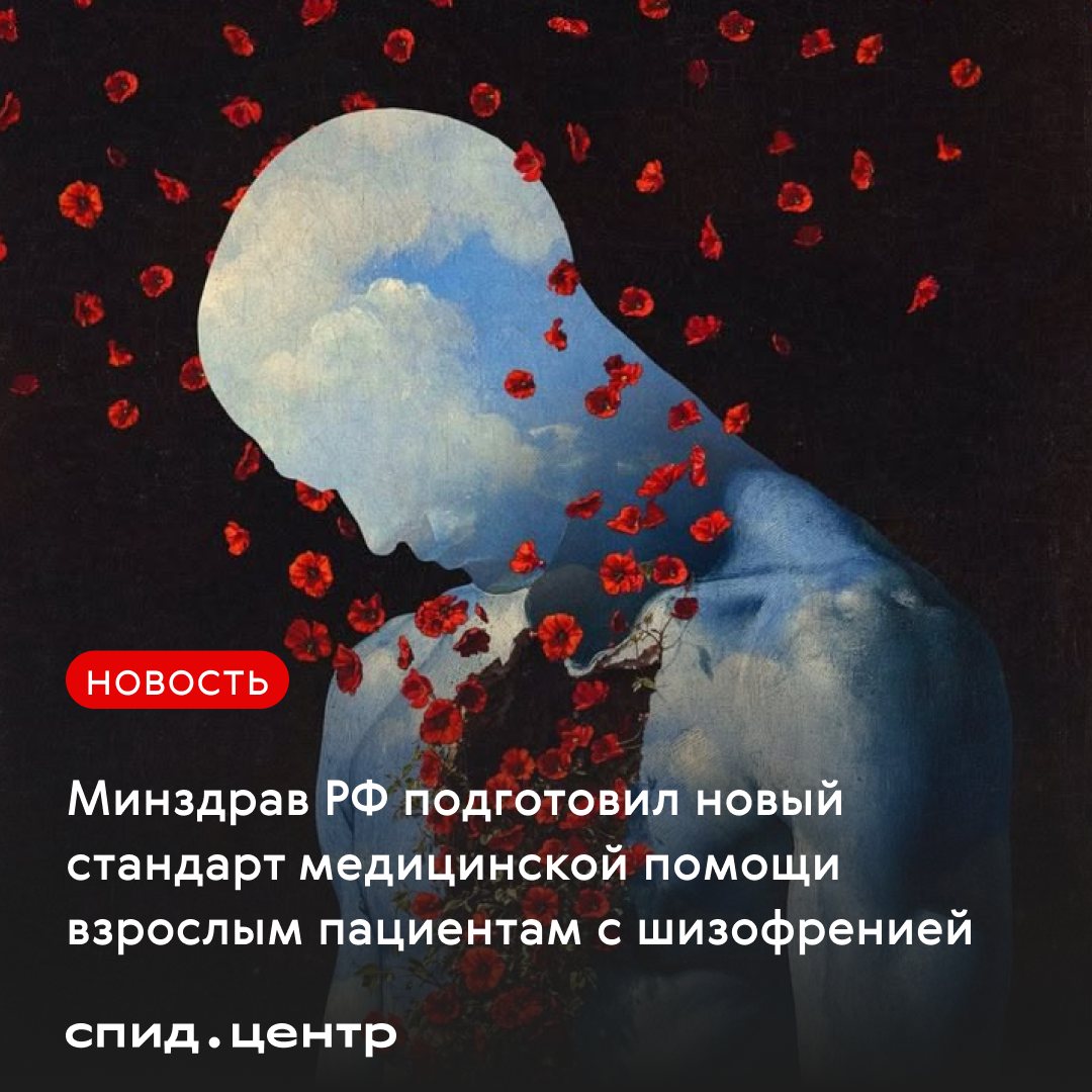
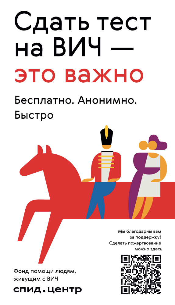
The mascot, the red horse and the small figures, was drawn before me: it is SPID.CENTER's existing identity. The photographs are the foundation's own. My work is the system, the rules and everything built from them.